scdtb Raw Data Plot Part 1
Building Raw Data Plots with scdtb
This blog will show you how to produce single case design raw data plots using the scdtb app. The blog post will focus on single case design plots that can be found in the What Works Clearinghouse Procedures and Standards Handbook, Version 5.0.
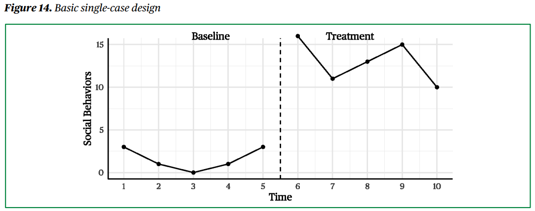
Basic Single-Case Design
The first example is for the single-case design data presented in Figure 14 of the WWC 5.0:
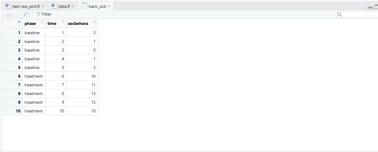
The write.csv R function was used to create the csv file used in this example. You can download this dataset using the button below.
To get started, got to mightymetrika.com click on Tools then click on scdtb to open the Single Case Design Tool Box app. Next, upload the basic_scd.csv dataset by clicking BROWSE..., navigating to the basic_scd.csv file, clicking on the file, then clicking Open. Once the data finishes uploading, you should see the screen below.
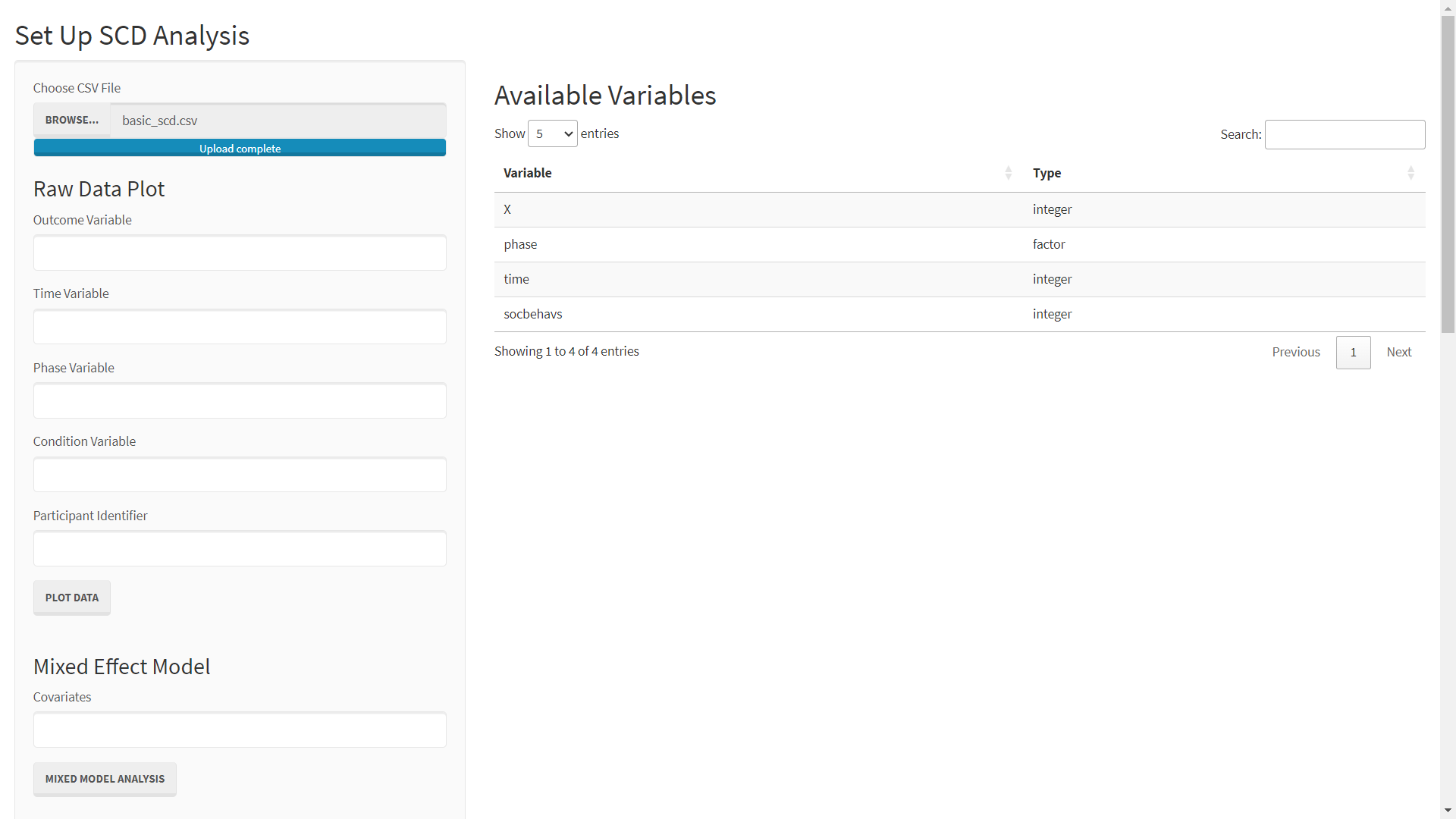
Note that, 'X' is the "row number" variable which is in the dataset due to my using write.csv default settings. We will ignore this variable.
To produce a plot similar to WWC 5.0 Figure 14, simply:
- Enter socbehavs as the Outcome Variable
- Enter time as the Time Variable
- Enter phase as the Phase Variable
- Click PLOT DATA
After following these steps, you should see the screen below.
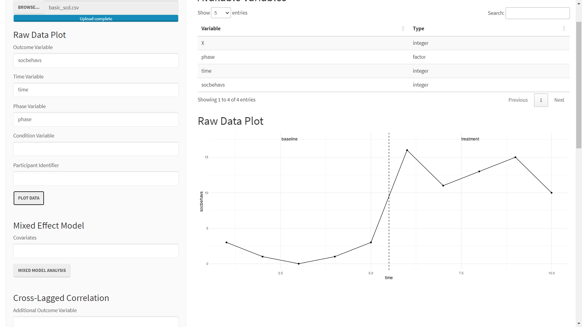
While this plot should allow one to draw the same conclusions as would be drawn from the WWC 5.0 Figure 14, it shows a few improvements which should be made in the next release of the scdtb R package. First, the values of time displayed on the x-axis should be selected more thoughtfully so that users can quickly see which time point each data point corresponds to. Another major difference is that in the scdtb app, a line connects the data points across the phase line. I'm not sure if this presents any problems, but if you would like to see this (or any other aspect of the app) changed in future editions, please submit an issue to the package's github.
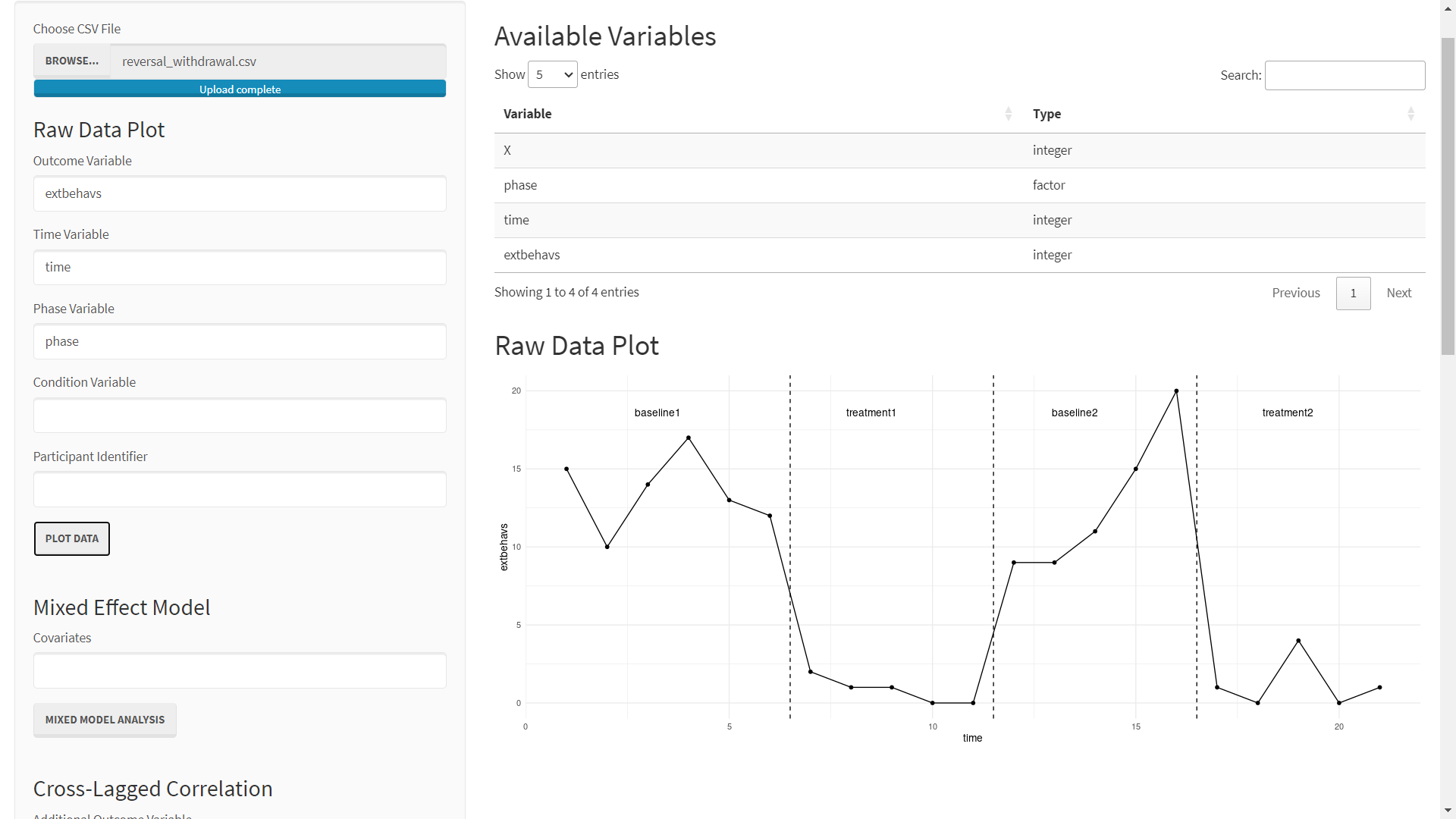
Reversal/withdrawal Design
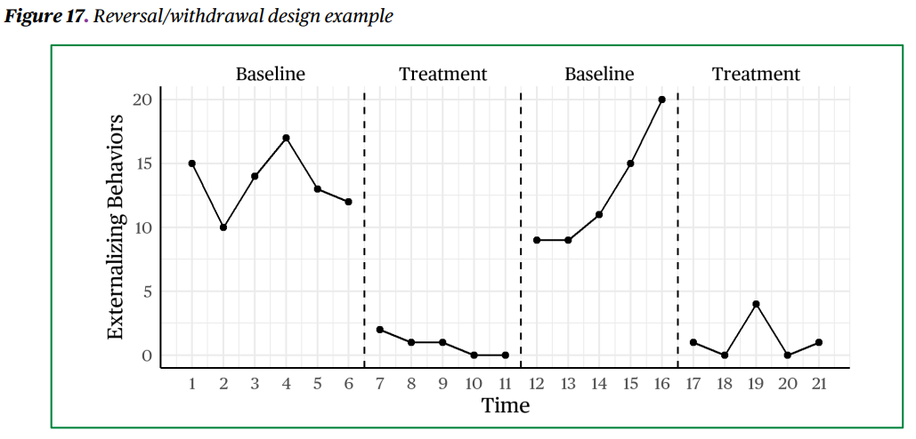
The next example is for the reversal/withdrawal design. This example is based on Figure 17 of WWC 5.0:
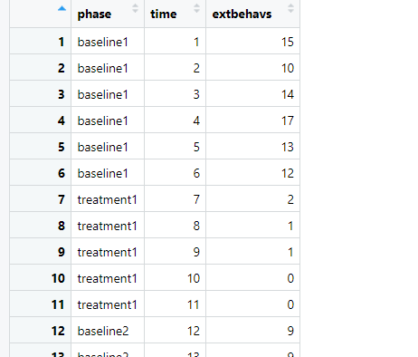
An approximation of this data is stored in the "reversal_withdrawal" dataset of the scdtb R package. View and download this data below.
As in the previous example, we start by opening the scdtb app:
- mightymetrika.com
- Tools
- scdtb.
Once the app is open, upload the reversal_withdrawal.csv:
- BROWSE...
- navigating to the reversal_withdrawal.csv file
- Click on file
- Click Open.
If all went well, you should see the screen below.

Plotting this data is very similar to the previous example. You can produce a plot like WWC 5.0 Figure 17 by:
- Enter extbehavs as the Outcome Variable
- Enter time as the Time Variable
- Enter phase as the Phase Variable
- Click PLOT DATA